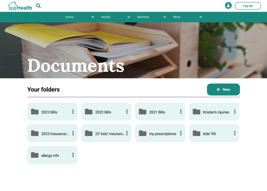
On mobile and desktop users have the ability to upload medical and health related documents securely.
After studying Google Material Design and leading drive applications I re-designed this page for improved usability.
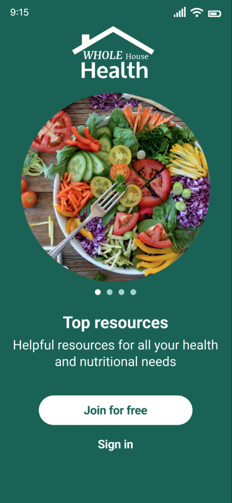
Mobile Spalsh Screen:
After feedback and testing, I listened to colleagues, and greatly improved the slide tutorial page for mobile.
With greater accessibility, the information conveys to every type of use what exact products the app has to offer.
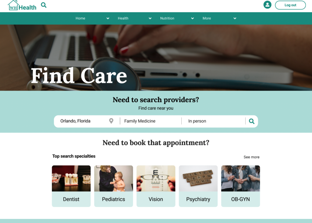
Find Care Search
On mobile and desktop users have three main search filters to find care. Due to the growing popularity of virtual visits, this search field was added after research and user testing.
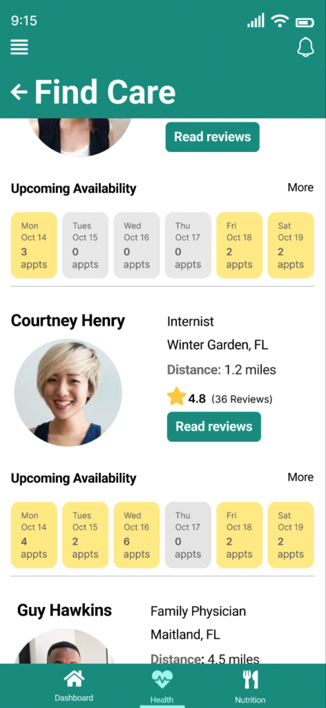
Find Providers:
After collaborating with colleagues, and usability testing I optimized how users choose a provider. “Distance” information was added, and also better accessibility for visually impaired users with padding and updated UI styling elements.
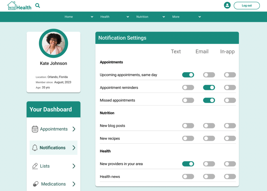
Notification Settings:
After participant feedback and testing this page was created to give users the freedom to choose notifications for receiving text and or email updates such as appointments or new information published to the app.